Her philosophy highlights the importance of thoughtful design choices in creating spaces that bring joy and comfort. Lighting is another crucial factor when choosing a color palette. Natural light can dramatically change how a color appears throughout the day. A shade that looks warm and inviting in the morning may appear cooler in the evening. It’s important to test paint samples in different lighting conditions before making a final decision. Artificial lighting also plays a role. Warm lighting can soften bold colors, while cooler lighting can make them appear sharper. Understanding how light interacts with color helps ensure consistency and avoids unexpected results once the room is complete.“I am going to make everything around me beautiful—that will be my life.”
– Elsie de Wolfe
 A reliable approach to building a color palette is the 60-30-10 rule. This design principle suggests using one dominant color for about 60% of the room, a secondary color for 30%, and an accent color for the remaining 10%. This balance creates visual interest while maintaining cohesion.
For instance, a neutral base color on walls can be paired with complementary furniture tones and accented with bold cushions, artwork, or decorative pieces. This approach allows flexibility—you can easily update accent colors over time without redesigning the entire room.
Another important consideration is flow between rooms. While each space can have its own personality, maintaining some consistency in color tones helps create a cohesive look throughout the home. This doesn’t mean every room needs to match, but complementary palettes ensure a smooth visual transition from one area to another.
Textures and materials also influence how colors are perceived. A matte wall finish will reflect light differently than glossy surfaces. Similarly, natural materials such as wood, stone, and fabric can add warmth and depth to a color scheme. Layering different textures within the same palette creates a richer and more dynamic look.
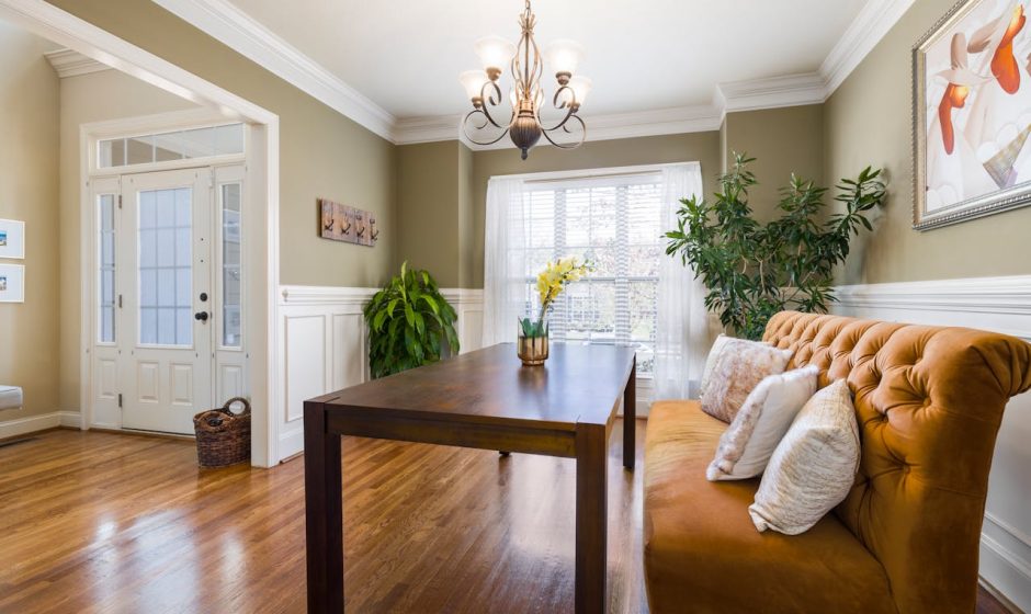
Neutrals remain a timeless choice for many homes because of their versatility. Shades like white, beige, gray, and taupe provide a clean foundation that works with almost any accent color. However, incorporating subtle variations—such as warm undertones or cool hues—can prevent neutral spaces from feeling flat or uninspired.
For those who enjoy bold design, statement colors can be used strategically. An accent wall, a piece of furniture, or even cabinetry can introduce a vibrant shade without overwhelming the space. The key is balance—bold colors should enhance the room, not dominate it.
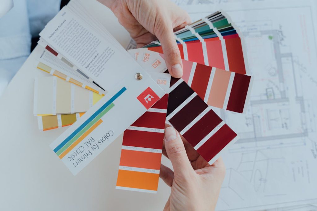
Personal preference should always guide final decisions. Trends come and go, but your home should reflect your taste and lifestyle. Creating a mood board with color swatches, fabrics, and inspiration images can help visualize how different elements will work together.
Choosing the perfect color palette is both an art and a science. By considering function, lighting, balance, and personal style, you can create rooms that feel cohesive, inviting, and uniquely yours.
With a careful approach and a bit of experimentation, color becomes more than just decoration—it becomes the foundation of a beautifully designed home.
A reliable approach to building a color palette is the 60-30-10 rule. This design principle suggests using one dominant color for about 60% of the room, a secondary color for 30%, and an accent color for the remaining 10%. This balance creates visual interest while maintaining cohesion.
For instance, a neutral base color on walls can be paired with complementary furniture tones and accented with bold cushions, artwork, or decorative pieces. This approach allows flexibility—you can easily update accent colors over time without redesigning the entire room.
Another important consideration is flow between rooms. While each space can have its own personality, maintaining some consistency in color tones helps create a cohesive look throughout the home. This doesn’t mean every room needs to match, but complementary palettes ensure a smooth visual transition from one area to another.
Textures and materials also influence how colors are perceived. A matte wall finish will reflect light differently than glossy surfaces. Similarly, natural materials such as wood, stone, and fabric can add warmth and depth to a color scheme. Layering different textures within the same palette creates a richer and more dynamic look.
Neutrals remain a timeless choice for many homes because of their versatility. Shades like white, beige, gray, and taupe provide a clean foundation that works with almost any accent color. However, incorporating subtle variations—such as warm undertones or cool hues—can prevent neutral spaces from feeling flat or uninspired.
For those who enjoy bold design, statement colors can be used strategically. An accent wall, a piece of furniture, or even cabinetry can introduce a vibrant shade without overwhelming the space. The key is balance—bold colors should enhance the room, not dominate it.
Personal preference should always guide final decisions. Trends come and go, but your home should reflect your taste and lifestyle. Creating a mood board with color swatches, fabrics, and inspiration images can help visualize how different elements will work together.
Choosing the perfect color palette is both an art and a science. By considering function, lighting, balance, and personal style, you can create rooms that feel cohesive, inviting, and uniquely yours.
With a careful approach and a bit of experimentation, color becomes more than just decoration—it becomes the foundation of a beautifully designed home.